Burp Suite Enterprise Edition

Burp Suite Enterprise is a web application security automation tool.

With the algorithms of it’s great-grandpa Burp Suite Professional, but the interface of a modern BI tool, it performs on-click scans and recurring scans of the user’s web application.

Scope

Design a modern and clean looking, usable interface for a React application.

Provide the development team with designs, instruction and vision for a new interface.

Lead a product design suitable for tablets and desktop devices.

Reflect the new direction of the PortSwigger brand.

Be familiar and intuitive to the user base.

My role

User research

Competitor research

Wireframes / mockups / protoypes

Style development

Interaction design

Collaborative design and build

Iterative design

Attend and contribute to development Retrospectives and Stand-ups

Project

PortSwigger Ltd

5-10

3 years

Desktop / Tablet React web application

My day to day tasks:

At the beginning

User research

Competitor research

Wireframing

Style development

For each area of the product

Studied the functions and interactions

Studied the depth to what was feasible

Designed / tested / shared / integrated

Helped guide the developers to achieve the design goals

Burp Suite Enterprise

What am I most proud of?

Improving design to development communications by introducing an interactive component library.

It is an age-old issue the design and development communication gap. Add in middle management and an ever-growing development team, and you have a real designer challenge.

As the team and product grew, I realised we needed some sort of system to document the rules and code snippets which we had created, before it was too late.

I’d always managed a Style Guide of sorts, but with over 100 components and a now large list of rules to go alongside all of this, it was no longer sharable or intuitive. I’d also become aware of what a lot of design thought-leaders were using to improve design systems.

Of course - thinking big - I jumped to all sorts of fully-fledged design system ideas… but after many collaborative conversations with the team, we decided the best compromise was a component library based on Bradley Frost’s Atomic structure.

Working with some of the developers, I managed to get to a point where we built a living and breathing component library using Storybook. As this was a React based app too, we could make sure the components within it ran of live code, so you had no risk of things going out if date.

I was very proud that I was able to insight this sort of project in a strictly AGILE environment, where previously the only focus has been on product development with little focus on technical and design debt.


Which design project made the biggest impact on the business?

Being part of an application design project from the start, can mean it is hard to pick an example of the work to talk about. Sometimes as a designer you find real beauty in the smallest interactions of how a user will find some information or solve a tiny but repetitive problem.

But, since the start of the whole development project, the real center piece of the application was always going to be the Dashboard. Not only as it would form a nice filter for the vast amount of data multiple scans creates, but also because it was what the users wanted.

Scope

To design a usable and attractive dashboard to advertise the product as a BI tool.

We would need to determine the most useful areas in the product to display graphical summaries of the data.

My role

Define what statistics were available to show the users
Identify the goals of the dashboard UI
User research
Competitor research
Ideation / wireframing / protoypting
Graph component design
Responsive design

Project

PortSwigger Ltd

5-10

4 months

Desktop / Tablet React web application

Responsive layouts

The scope for the dashboard project was aimed at three areas of the system.

One would be a brand new homepage style fullscreen dashboard, the other two would be smaller sections to go within the already existing scan details and site details pages.

This meant, all the widgets needed to be componentised.

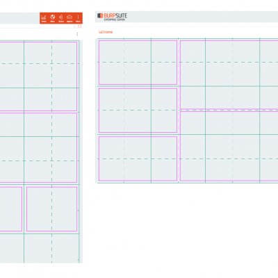
Also, that the layout needed to be responsive not only to the size of the display, but also to the size of the pane it was meant to fit within. As the application layout supported panes closing and opening, this also needed to be considered.

The layout also needed to support different sizes of rectangular widget so that the contents of each widget could be displayed in the optimum way.

Designing the widgets

As a designer, you are always trying to translate either the meaning of data or text, into something visual. But designing a dashboard full of usable widgets, each thought out fully, was full of challenges:

What did the user need to know when they were on those specific screens?

The time prioritised for user research was minimal so I conducted focussed interviews with key people who had close relationships with our users, so our support staff, our product manager and some of our senior developers who also interacted with the users. As the screens were effectively summary screens of the data we already collected, we could make a good estimate as to what would be useful to show - being a development heavy company, the model we worked to was to get it designed, built and delivered quickly, and then iterate with user feedback afterwards.

What could feasibly be designed and built within the OKR time frame?

The company had recently announced a new OKR system, so I had to work closely with the development team and product manager to make sure what I was designing would work with how they were planning to build and release. I achieved this by making sure I walked over to people’s desks and updated the team at each stand up of my progress.

What data was available?

I worked closely with the developers and PM to make sure we all knew what data would be available so the design stayed within the restrains of what was feasible.

What styles would work within the current interface?

As always I mocked up many alternatives for how these new components would look. I drew inspiration from Google Analytics, Microsoft BI and other dashboards I could find on the internet - studying interactivity, design patterns and behaviours. I presented designs to the team so gain feedback and tweak until we were all happy.

How would the widgets look if placed in different positions, together or away from each other?

I used the same simple colour pallet, text styles, layouts and interaction behaviours for each widget - a lot of this matched the current design rules used throughout the system. I studied other dashboard components to make sure I knew how the structure should look, and potentially how these widgets may evolve in the future. As each part of the widgets were componatised, this meant I could mix up their different content types but they would all still look part of the same family.

Lessons learnt

‘3 Amigo’ approach to communication was key to making sure the team kept aligned properly.

Pairing with the developers saved a lot of time when explaining complex design features.

Rome was not built within an OKR timeframe. Designing components which could be released gradually fit well with our release cycle.

Dashboard design is hard, but rewarding.