Chrysalis Finance Website Update

Chrysalis Finance are an FCA accredited finance provider for medical and dental payments.

Scope

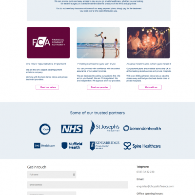
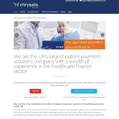
The company’s website was in need of a spring clean. Over the years it had become badly organised, looked dated and didn’t communicate to the right people, what the company could offer.

I needed to improve navigation, layouts, readability, style and accessibility. Also, shift the focus from B2C to B2B.

My role

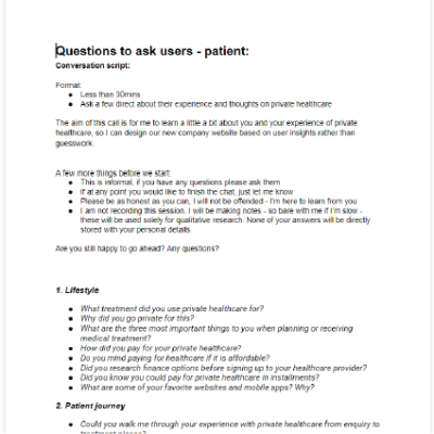
User research via interviews

Competitor research

Wireframes / mockups / protoypes

Style development

Interaction design

Wordpress front-end web build

Project management

Project

Chrysalis Finance

1-5

1 month

Public facing Wordpress website

What am I most proud of?

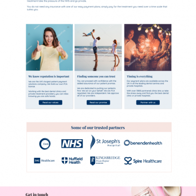
This is one of the first projects which I managed from start to finish. I'm really happy with the final design, as I think it looks professional and speaks directly to the audience.

It’s quite hard in app development to work fast and effectively and see your ideas come quickly into fruition, but this was a nice micro-project which has resulted in a transformation of how our company looks to the rest of the world.

I’m really happy with the navigation of the site. Before we did this work it was all over the place with way too many pages, we now only have a handful of well thought out pages, which has simplified the experience massively.

Bringing in more contact forms and CTAs, should hopefully have an impact on sign up rates too.

My process

Analysis

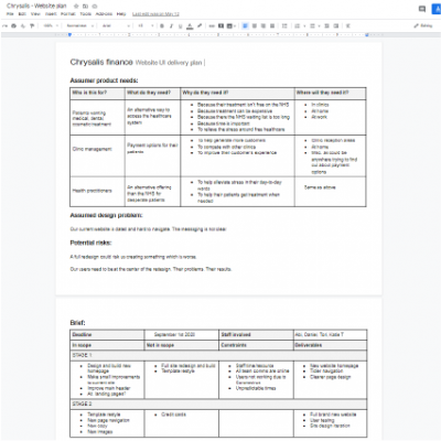
Look at the old website content and navigation to see what the positives and negatives were

Interviews

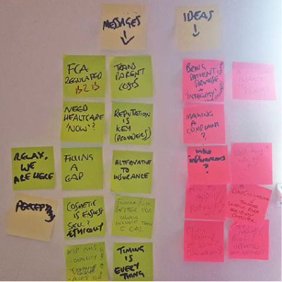
Speak to private and public healthcare professionals, patients, and support and marketing staff. The aim here was to get an idea of where our company stood in the market, what was important to our customers, who our likely customers would be, what the key messages should be.

Collaboration

Work closely with the marketing team of messaging, feeding my own research into the discussion.

As I was the developer on this project, lots of time could be saved as I knew how I was going to build the pages.

Protoypes

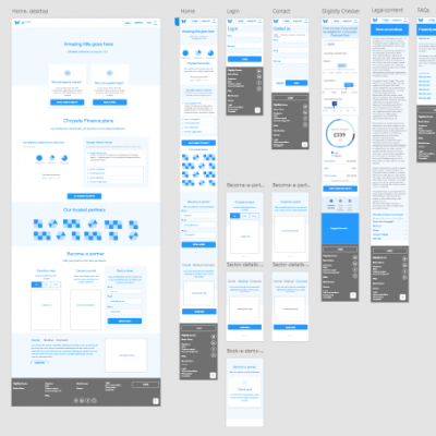
Using Adobe Experience, I mocked up low resolution prototypes of the new layouts and navigation.
I exported and shared these with key team members so they could feedback their thoughts.

Content, navigation and architecture

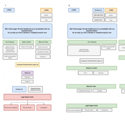
Using Google draw.io, I sketched out many of the different user flows. I also mapped out where new content could go based on hierachy of information.

In the end a lot of what I have planned changed rapidly as discussions went on with the team, but it gave me a good understanding of what we were working with.

Feedback sessions

Presented design ideas to the marketing team and other key stakeholders like the CEO and technical director.

Mock ups

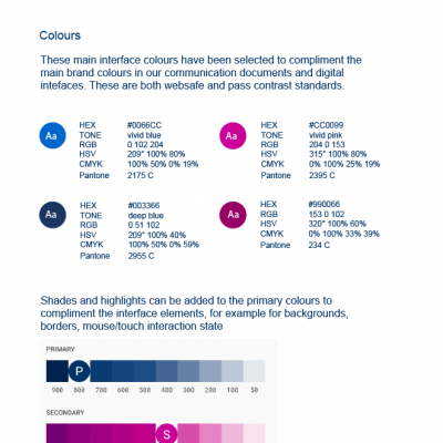
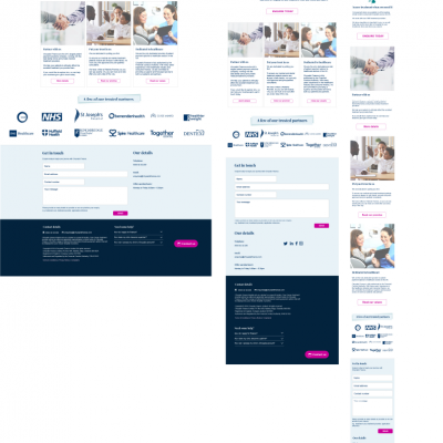
Using Adobe Illustrator and Photoshop, create multiple mockups of how the new site could look - including mobile, tablet, desktop. Making sure the styles align with the company Style Guide

Iteration

Taking on feedback from the team and users is important throughout a design process.

This improves the final product and avoids big mistakes.

Build

Take the final designs and build the pages in Wordpress. Learning how the template works.

Test

Circulate for further feedback and testing internally, and externally. Cross-browser and device tests.

Monitor

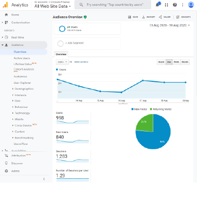
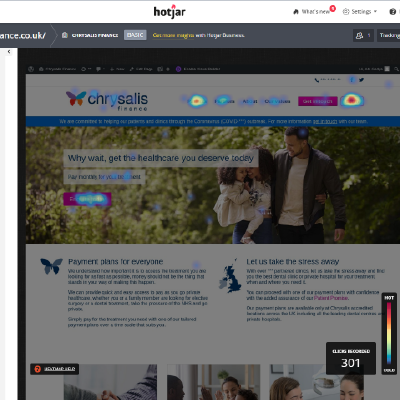
Keep and eye on Google Analytics and Hotjar to see if the redesign is having the desired impact.

Lessons learnt

I didn’t speak enough to the CEO about his vision for the new website. I think it is really important to interview all stakeholders when planning a design project like this. It was quite difficult pitching to him nearer the end of the design process, when he had barely been involved.

However I think overall the way in which I collaborated with the rest of the team was very successful, and the CEO on the whole was very happy with the results, so I probably did have the right amount of information to do the job.

Also, I hadn’t worked that much with Wordpress so that was a good learning experience for me.